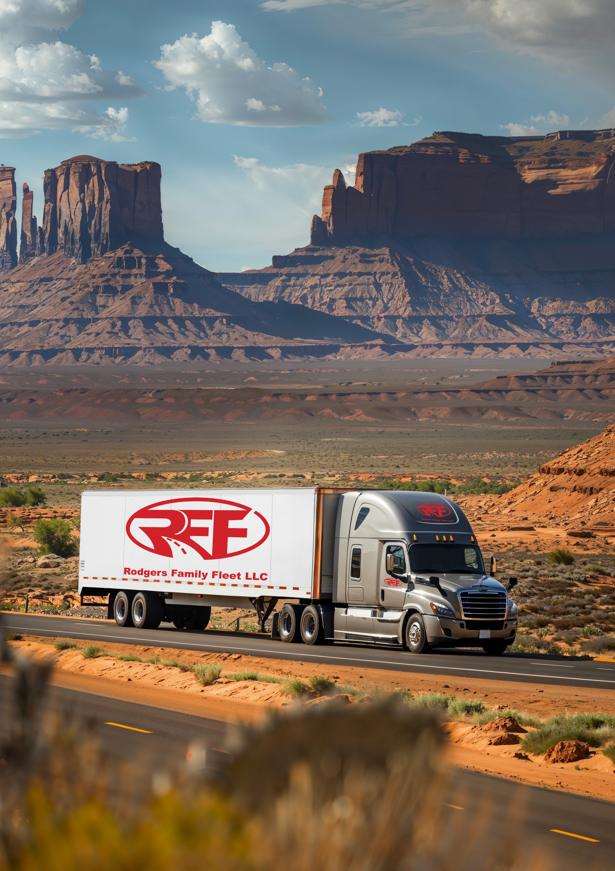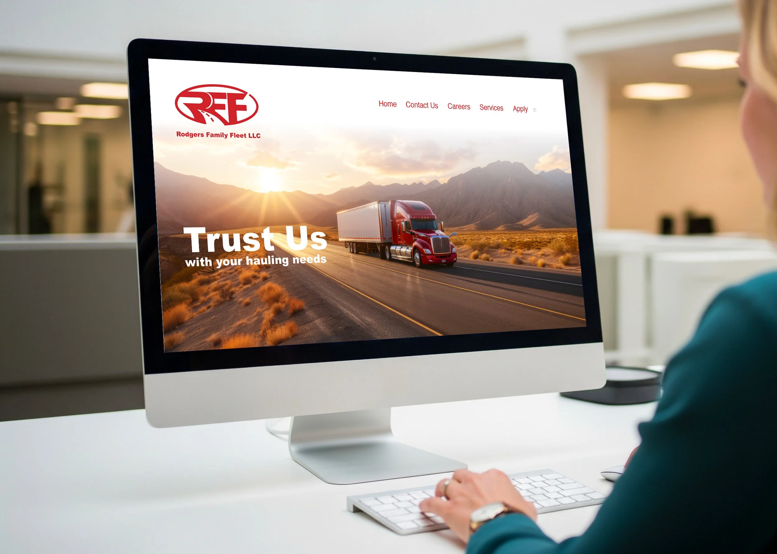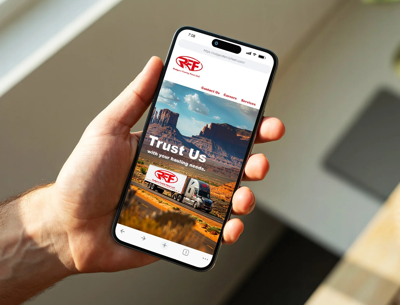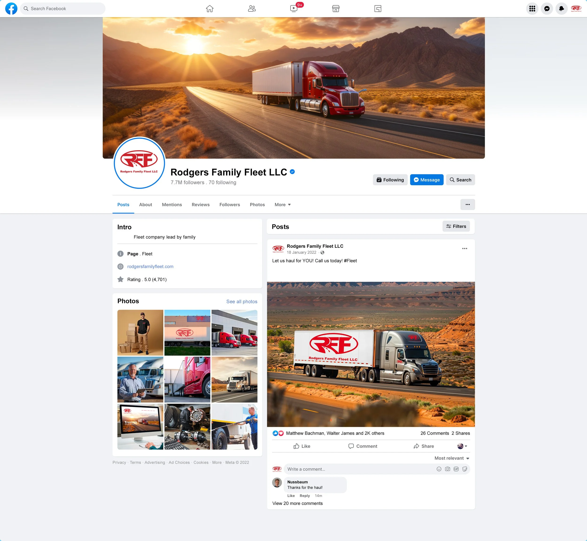
Company Branding: Rodgers Family Fleet LLC
Illustrator 2026, inDesign 2026, Photoshop 2026
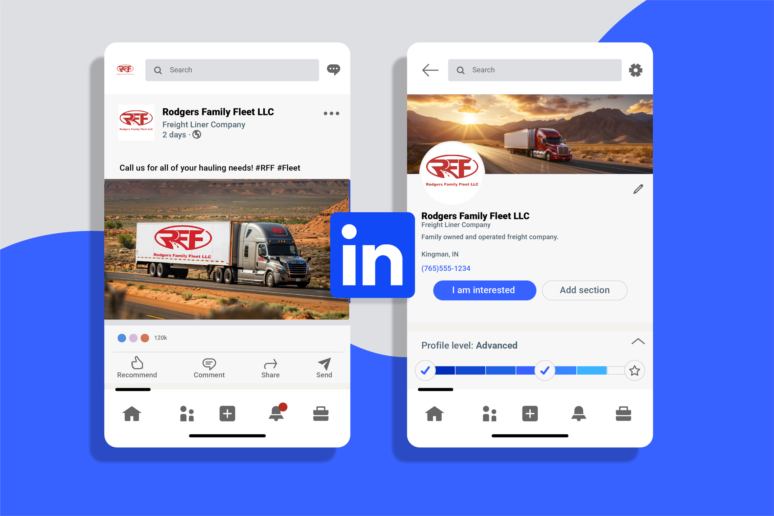
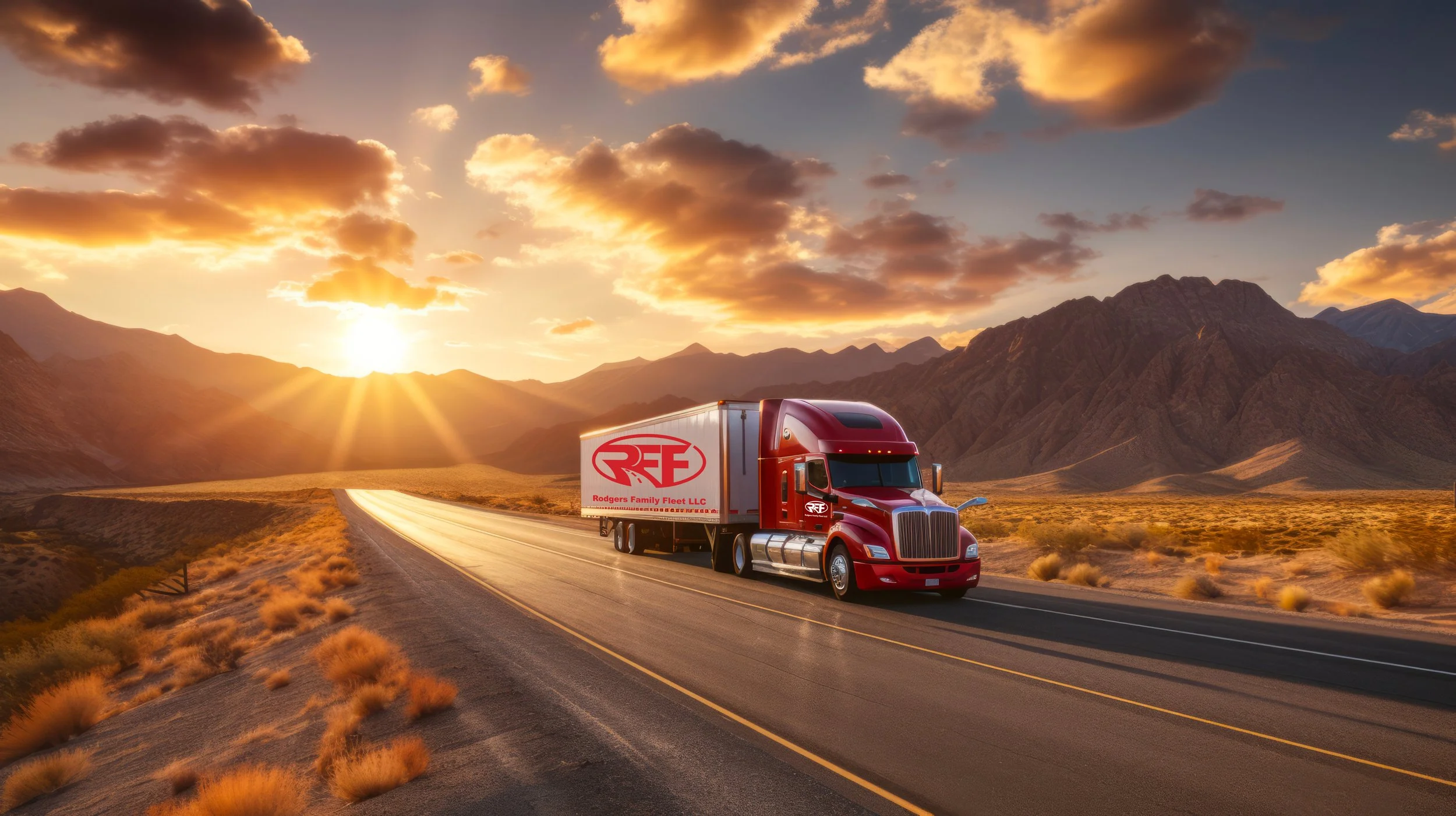
This rebrand marks the company’s shift from a small farm to a growing transportation business. The new name reflects expansion and a forward looking vision. Red conveys confidence, strength, and urgency, while bold sans-serif typography creates a reliable, straightforward feel. The identity is designed to scale across digital platforms, print materials, and semi-truck signage.
Purpose: To build a strong, trustworthy brand that supports growth and stands out in a competitive industry.
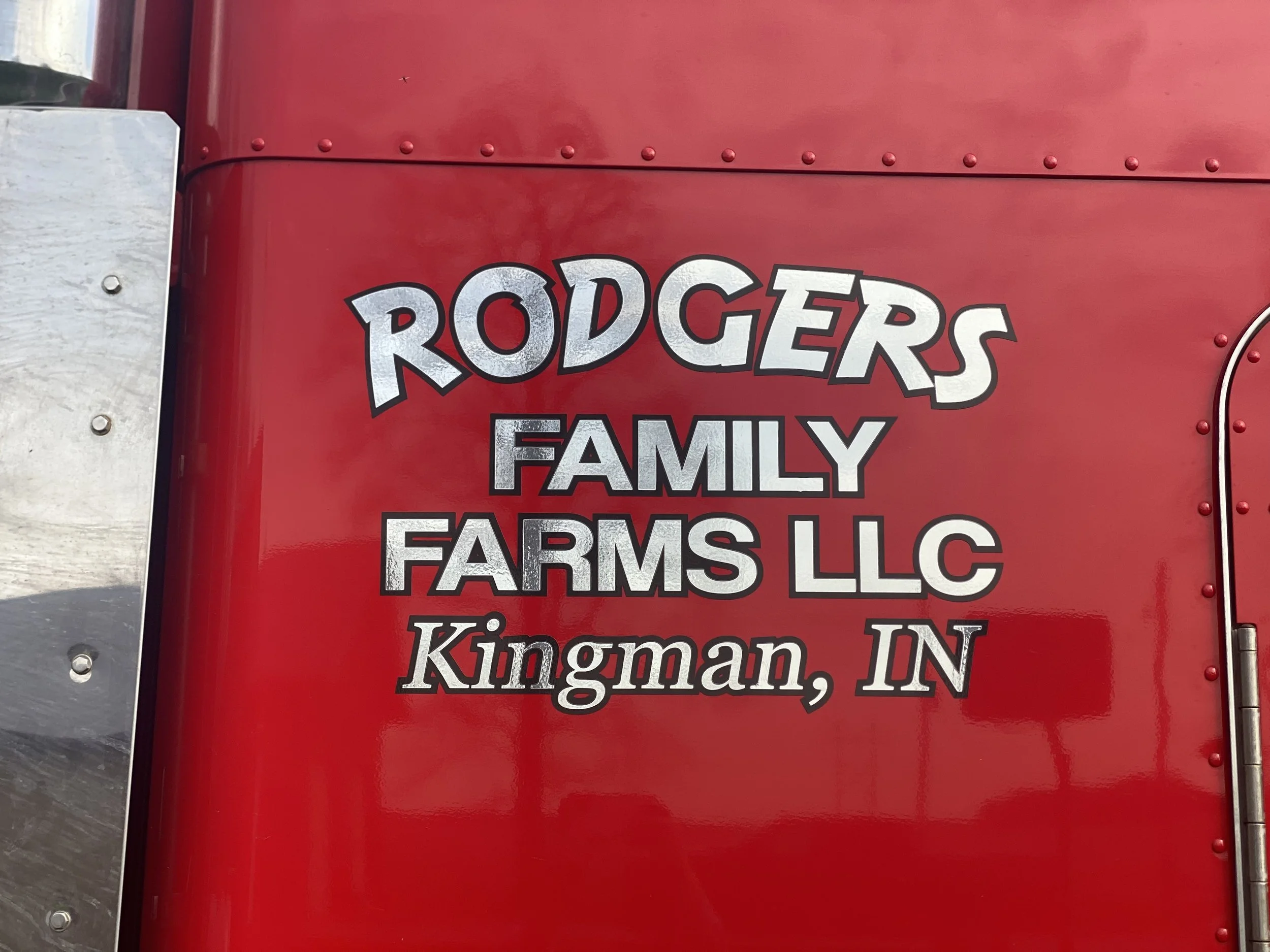
Current Brand

Sketches
Initial logo sketches exploring typography, trucking imagery, and motion to define a strong, reliable brand direction.
Typography
Arial Black was chosen for its bold, blocky form and strong appearance, reflecting durability and reliability while remaining highly legible across all applications.

Digital Drafts
After exploring several digital drafts, I found the first design too simple and the second lacked scalability. The final concept incorporates a road motif within the business abbreviation, resulting in a design that is both legible from a distance and visually concise. The final logo design is cohesive throughout.
Original Logo

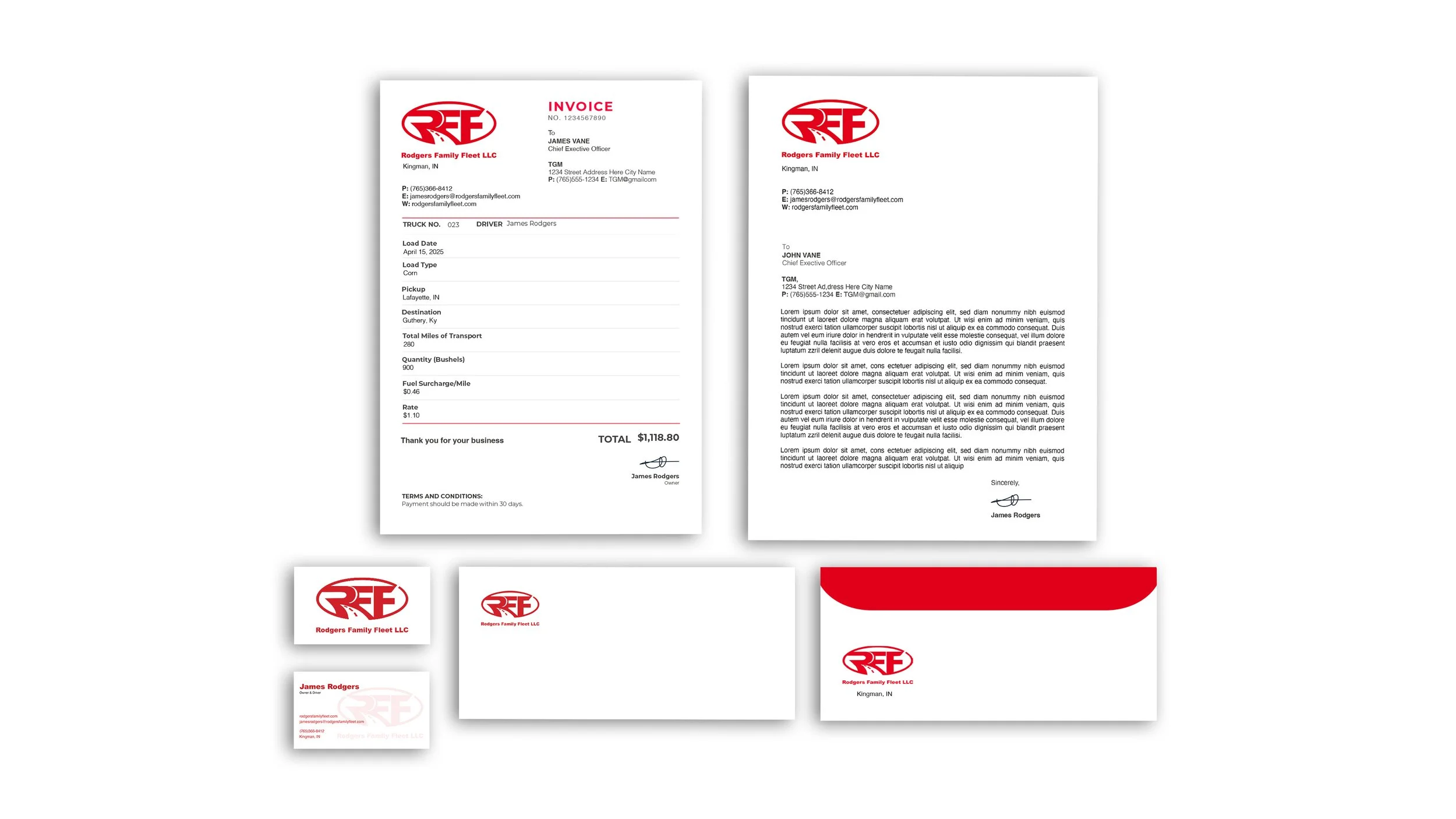
Stationary
Environmental Contact

Color Palette
Red anchors the logo across business cards, invoices, and the website, while black is used for visibility when placed on red trucks, together with white and gray for clarity and balance, ensuring a strong, versatile brand.


CMYK: 11, 100, 100, 4
RGB: 190, 52, 48
#BE3430
CMYK: 0, 0, 0, 0
RGB: 255, 255, 255
#FFFFFF
CMYK: 0, 0, 0, 100
RGB: 0, 0, 0
#000000
CMYK: 49, 41, 41, 5
RGB: 136, 135, 135
#888787
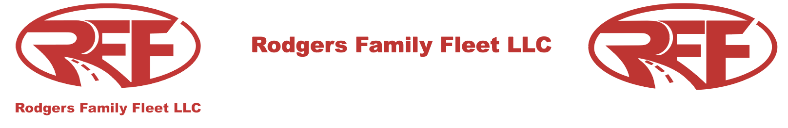
Final Logo
Lockup 1
Favicon


Lockup 2