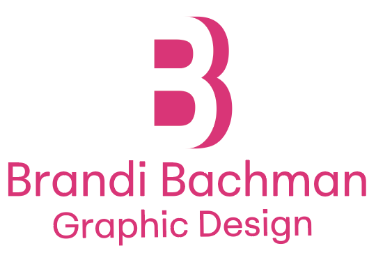
Brandi Bachman Graphic Design Brand Identity
Illustrator 2026
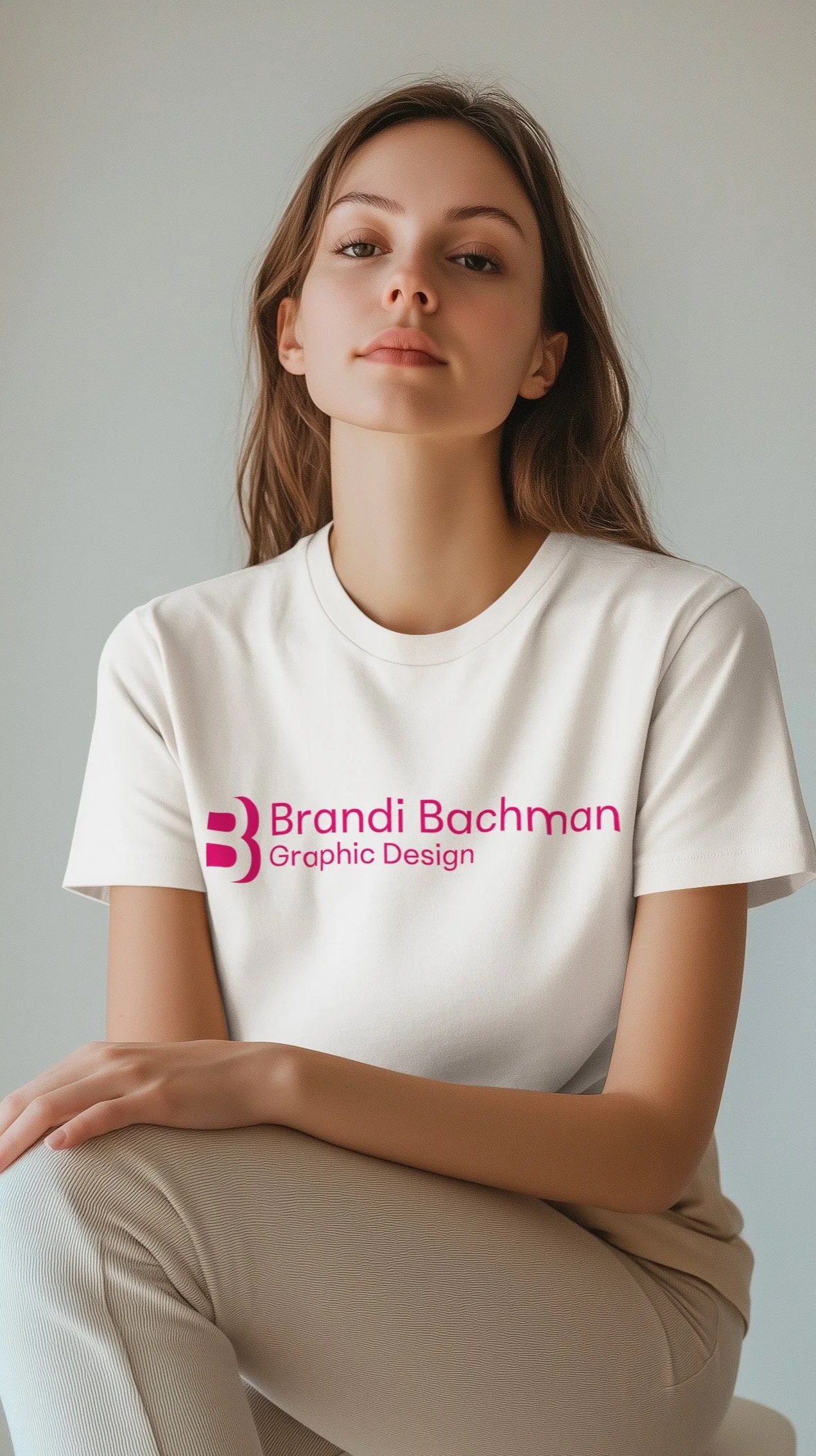
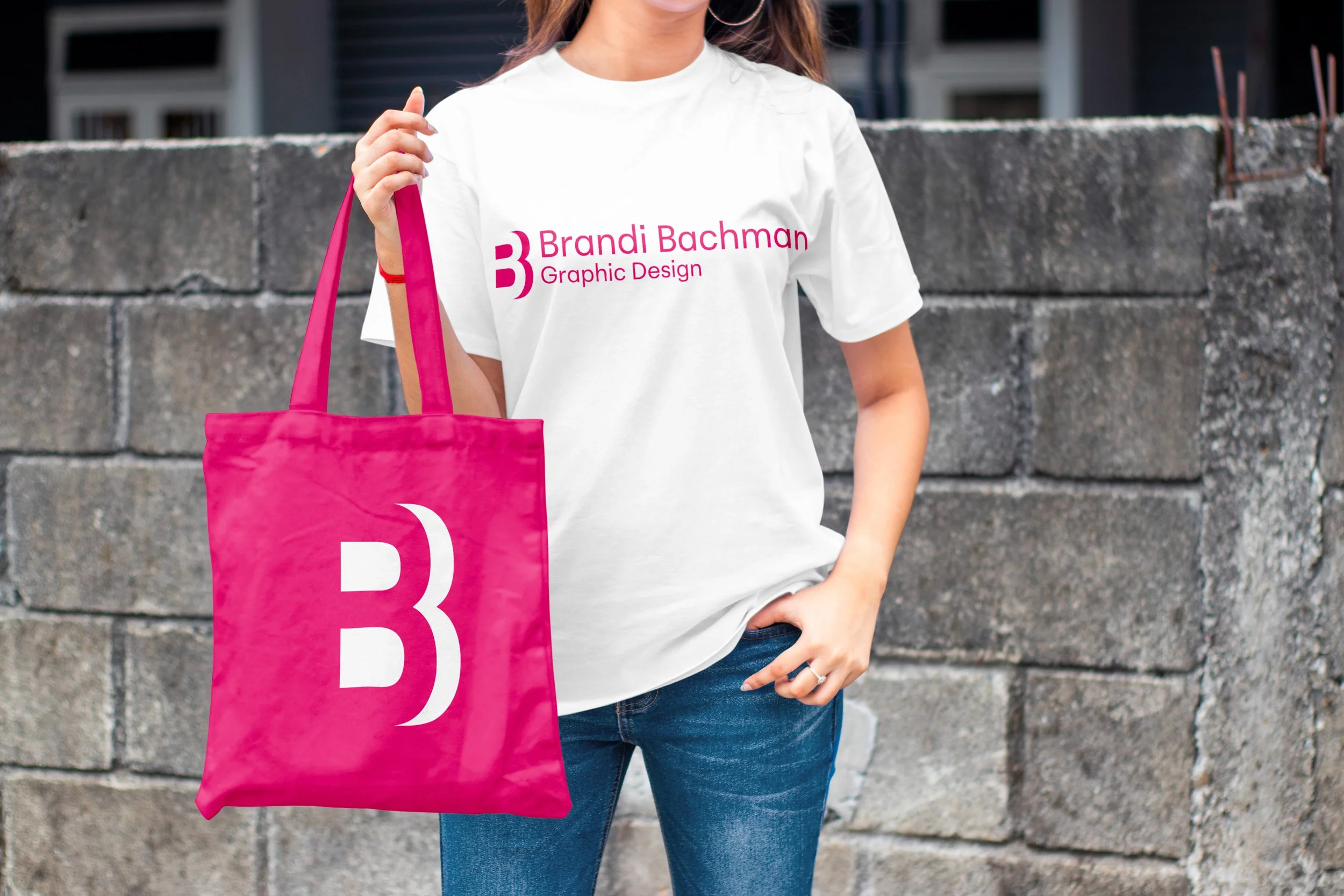
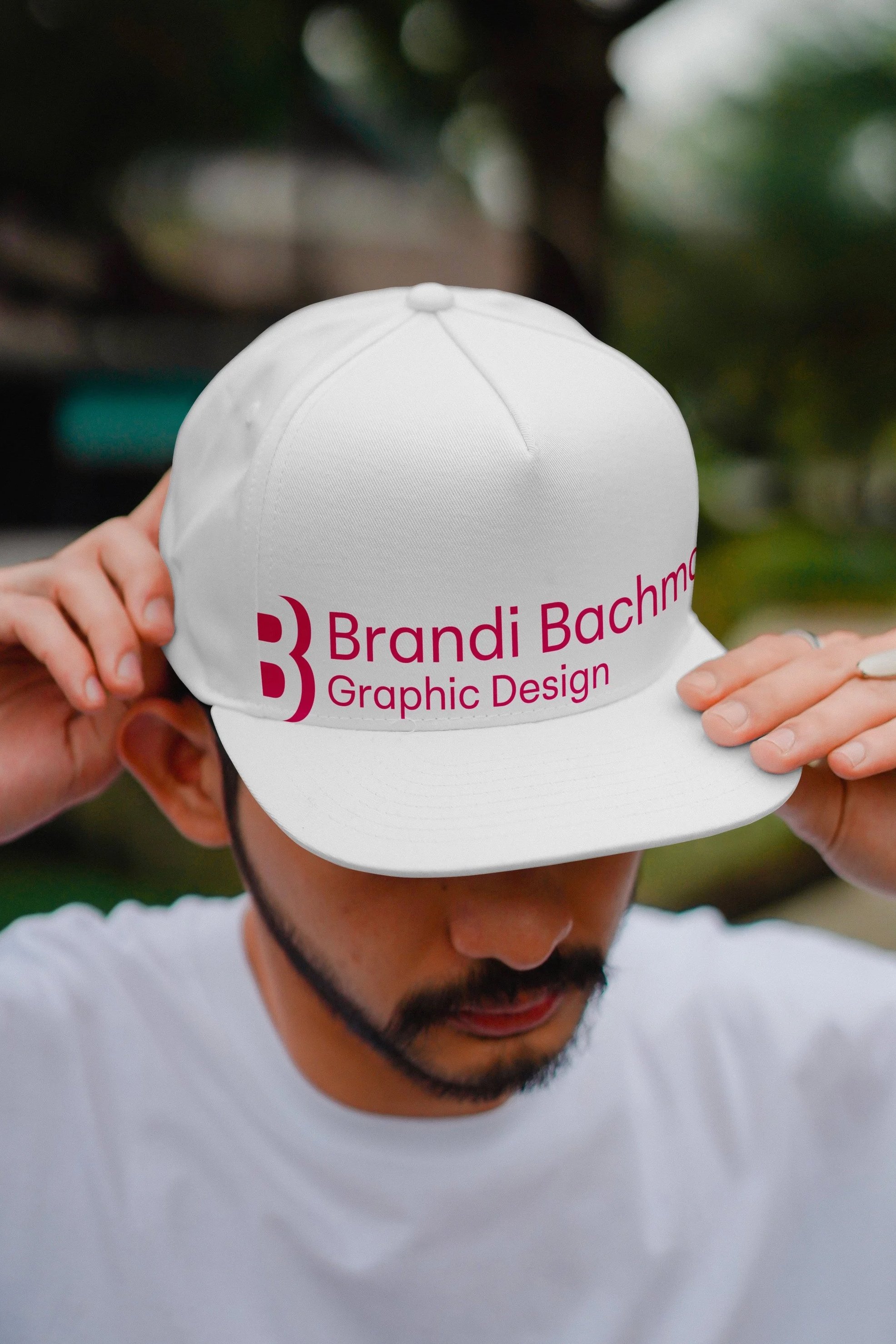
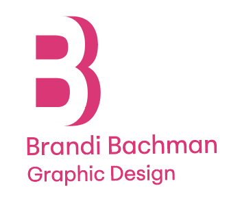
My identity uses bold typography and a confident color choice to create a strong, refined voice. It’s designed to communicate clarity and confidence while maintaining a sense of personality. Positioned for high-end visibility, the work is intentional, polished, and crafted to attract discerning clients.
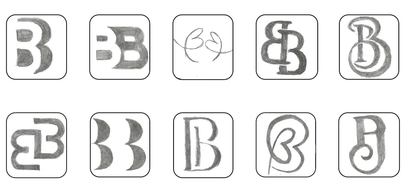
Sketches
These sketches explore weight, form, and structure to refine tone and personality. The process led to a mark that feels confident, intentional, and aligned with my brand.
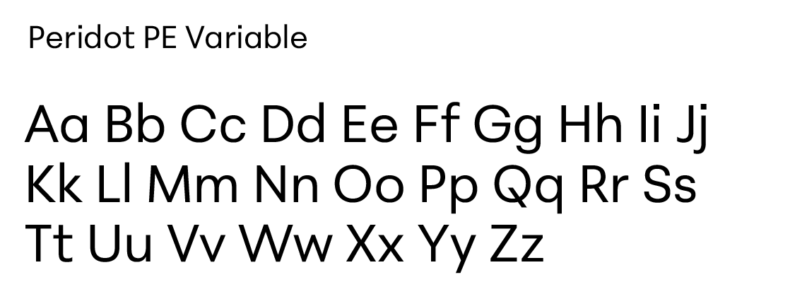
Typography
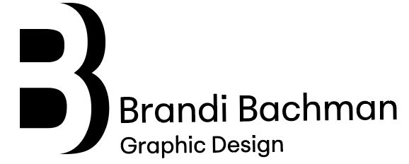
Peridot PE Variable was chosen for its clean, modern feel and subtle personality. Its variable weights provide flexibility, supporting a confident, professional, and approachable identity.
Digital Drafts
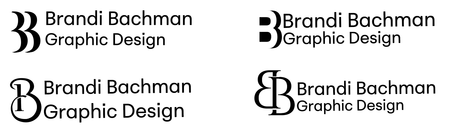
Translating sketches to vector revealed clarity and spacing issues: the first read as “33,” the second needed refinement, the third lacked scalability, and the final felt too traditional.
Refinement
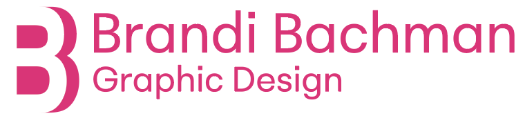
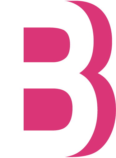
Bright pink was chosen for its standout quality. The second option felt most confident and scalable, and aligning the “B” with the name and profession improved balance and cohesion.

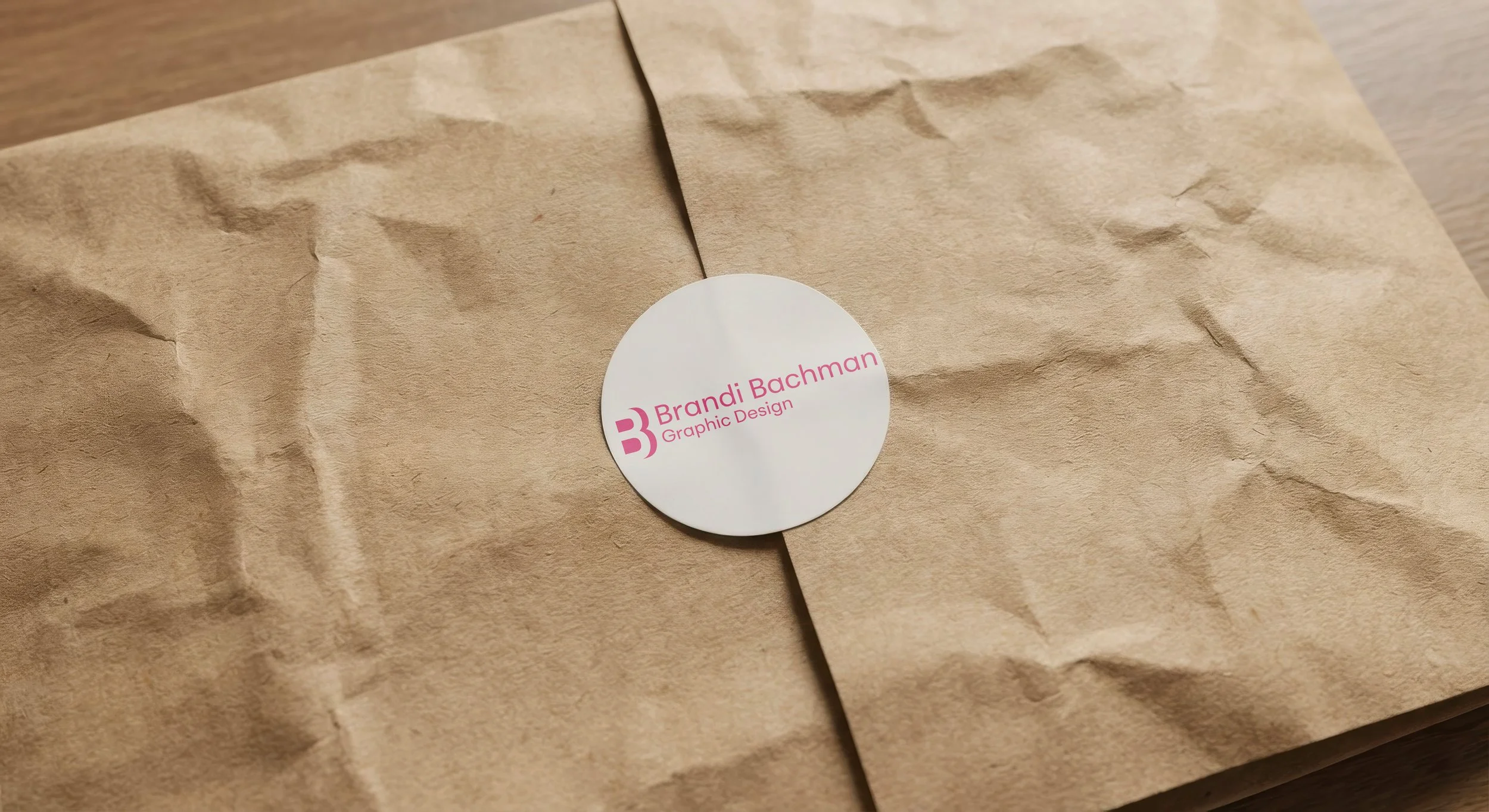
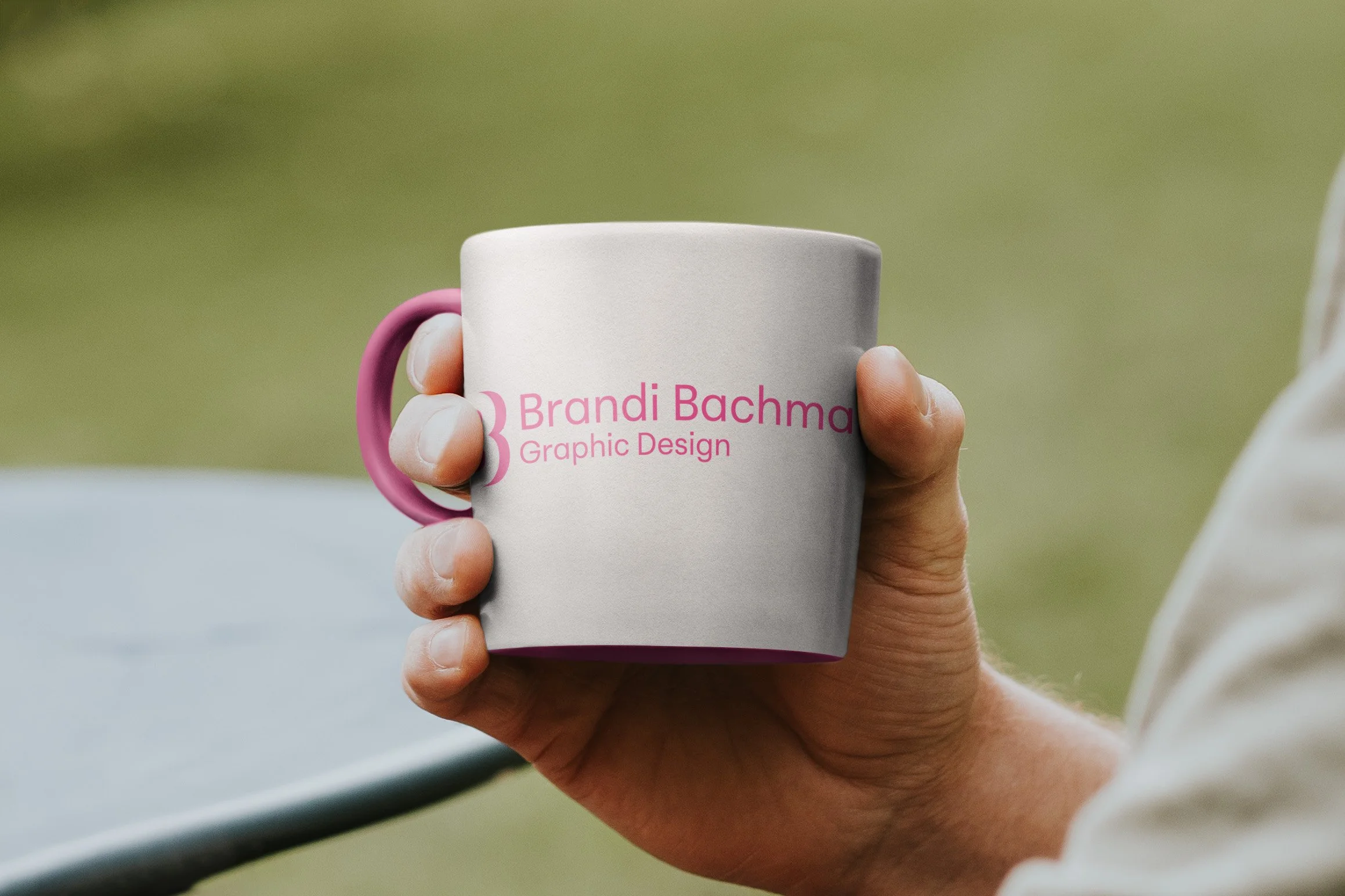
Environmental Contact
Color Palette
Bright pink conveys joy, confidence, and warmth, creating a bold, energetic, and memorable presence that balances professionalism with approachability.

CMYK: 0, 98, 21, 0
RGB: 218, 55, 119
#DA3777
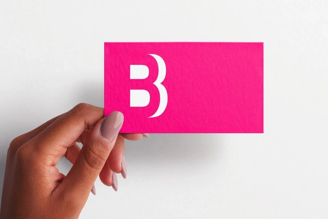
Final Logo
Lockup 1
Lockup 3
Favicon
Lockup 2